Following the traditions of Italian craftsmanship
Peroni Nastro Azzurro exemplifies the traditions of Italian craftsmanship, passion and flair upon which it was formed.
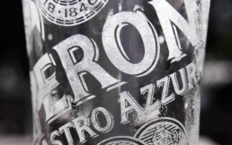
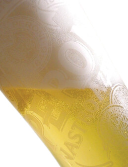
During the brand refresh of Peroni by the Brand Union, I was tasked to re-imagine the new glass, or ‘chalice’ as it become known.
The design was based on the delicate Italian biscotti wrappers often found in cafés and bars in Italy. Laser etched into the fine glassware, the Peroni crest was set at a 14 degree angle, designed to become eye level to onlookers when the recipient took their first draft.
Unfortunately, this beautifully crafted version didn’t last too long. The glassware was too delicate to withstand bar glasswashers and they frequently exploded. They were replaced by heavier versions with a vinyl decal.
A lesson in both form NOT following function, and arguably, work that didn’t work, but hey, they were amazing. For a while.
Client: SAB Miller
Agency: Brand Union
Role: Design Director


