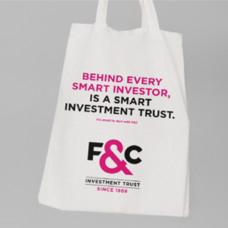
It's smart to start with F&C
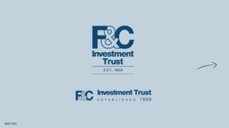
F&C Investment Trust has been in business for over 150 years. This heritage and provenance are proof that F&C have never stopped thinking ahead, and never stopped putting their customers first. It’s less about them, and more about their customers.
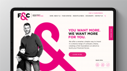
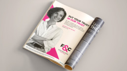
The visual identity was inspired by the idea of ‘F&C and you’ – helping you (the customer), achieve your financial goals and setting you up for success. The dominance of the ampersand helps to communicate this in a bold graphic way.
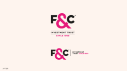


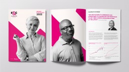
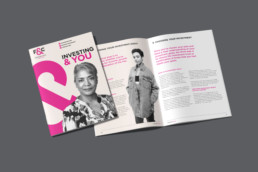
A bold, vibrant visual identity that represents a definitive break with the category’s corporate traditions – using a hot fuchsia as a primary colour – moved the brand away from the ‘banking blue’, so often associated with finance, to give F&C a truely ownable, and standout identity.
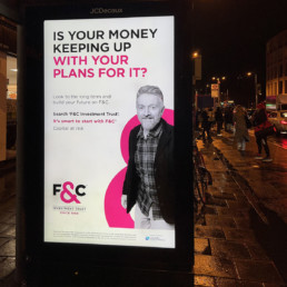
Using the distinctive, bespoke ampersand as a supergraphic creates a unique and recognisable asset for use in all brand communications. The black and white portrait photography style is direct, straightforward, and distinctive in the sector.


Client: Heavenly Group for F&C Investment Trust
Services: Visual identity & guidelines. Photographic art direction. Assets and applications: print, digital, OOH and broadcast advertising