BDC
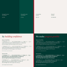
By Building Confidence, we make Progress Possible.
Client
BDC
Services
Brand Strategy
Brand Positioning
Brand Identity
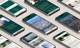
Digital Design
Social Media
Art Direction
Role
Creative Director & Project Director
A progressive rebrand for British Columbia's leading Quantity Surveyor
Background
Since 1988, BDC has been advancing the role of Cost Consultants in Canada, helping clients navigate complex projects with confidence and expertise.
Brief
Under new leadership, BDC wanted a brand that reflected both their rich history and their forward-thinking vision. They commissioned a refreshed positioning, strategy, and identity that could tell their story, communicate their values, and showcase their ambitions for the future – all while building on the strengths that made them trusted in the industry. In short, BDC 2.0.
Insight
In a market often slowed by unnecessary processes and bureaucracy, BDC stands apart. Their approach is agile and practical, solving client challenges quickly and effectively, whether from a lender or developer perspective.
Solution
By Building Confidence, we make Progress Possible. This positioning captures BDC’s mission: enabling progress through expertise, diligence, and trusted relationships. Confidence is at the heart of everything they do, helping clients achieve more and move forward with certainty.
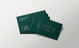
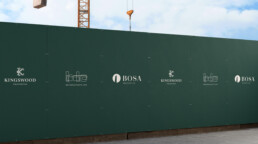
The new identity reflects this blend of professionalism and agility. At its heart is a single, clean, undulating line inspired by Vancouver’s dynamic skyline and modern architecture. The logo is more than a visual mark; it represents BDC’s values, their home city, and their forward-looking vision. It’s subtle, distinctive, and unmistakably BDC – once you notice it, it becomes part of the story.


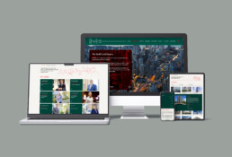
Colour played a significant role in bringing the new visual identity to life. Inspired by Vancouver’s natural surroundings, we selected a palette of deep greens that are seen from the city, and reminiscent of the Pacific waters, with a flash of red as a nod to the Canadian flag, These colours give the brand a sense of deep calm and professionalism, while also maintaining a connection to nature. The ‘buff’ canvas colour was inspired by the project folders used by the business on a day-to-day basis.
Typography was key component. We opted for a typeface that balanced classic modernity with legibility. The font’s bold yet minimalistic design is a visual foil to the architectural lines in the logo, reinforcing the brand’s strong, forward-thinking image.

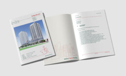
People photography was another key part of the rebrand. In a sector awash with bland corporate headshot portraiture, we believed that, as a people focussed business, BDC should celebrate the diversity and personality of it’s people. Natural, unrehearsed, and aspirational, the imagery is warm and engaging, and captures the positive spirit of the people who work at, or with BDC.
We created a suite of playful keyline illustrations to accompany the other assets to add storytelling to the visual language. A refreshed iconography set that compliments the logo and illustrations has been introduced to help users navigate complex business offers and services.


Credits
Brand Strategy
Chris Davenport
Portrait Photography
Mabeth (Beth) Lugtu
“Dan and his team took our business through the entire branding process – from inception through to completion – with clear directives and a positive vibe.
The creative abilities, attention to detail, and diligent approach to deliver the end product, is both considered and refreshing.
Dan has my firm endorsement as a sterling marketing and branding specialist, and I look forward to working with him in the future.”
Jody Pamplin
CEO & Managing Director, BDC