SARACEN
Feeding the Difference
Client
SARACEN
Services
Brand Ideation & Concept
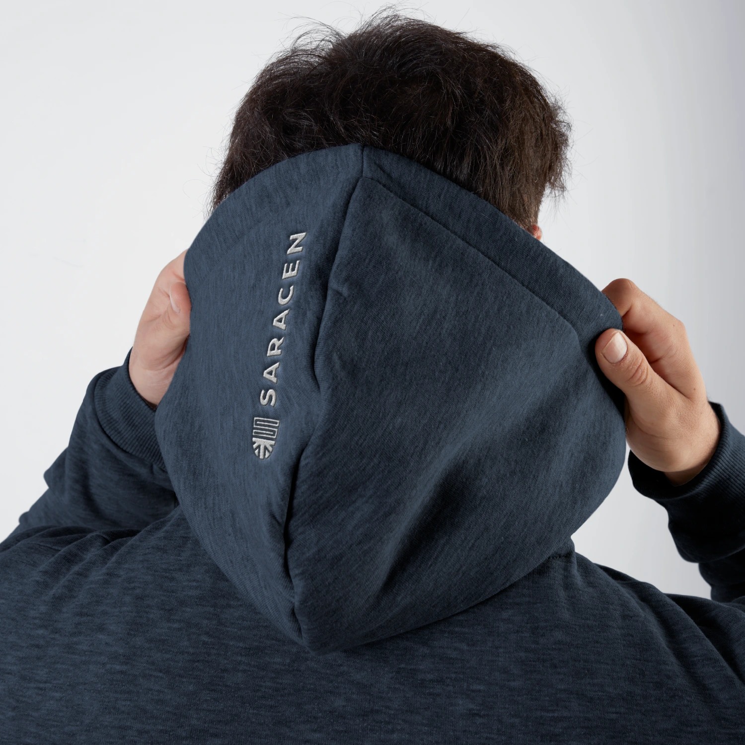
Brand Identity
Art Direction
Graphic Design
Digital Design
Packaging
Signage
Role
Creative Partner
Related projects:
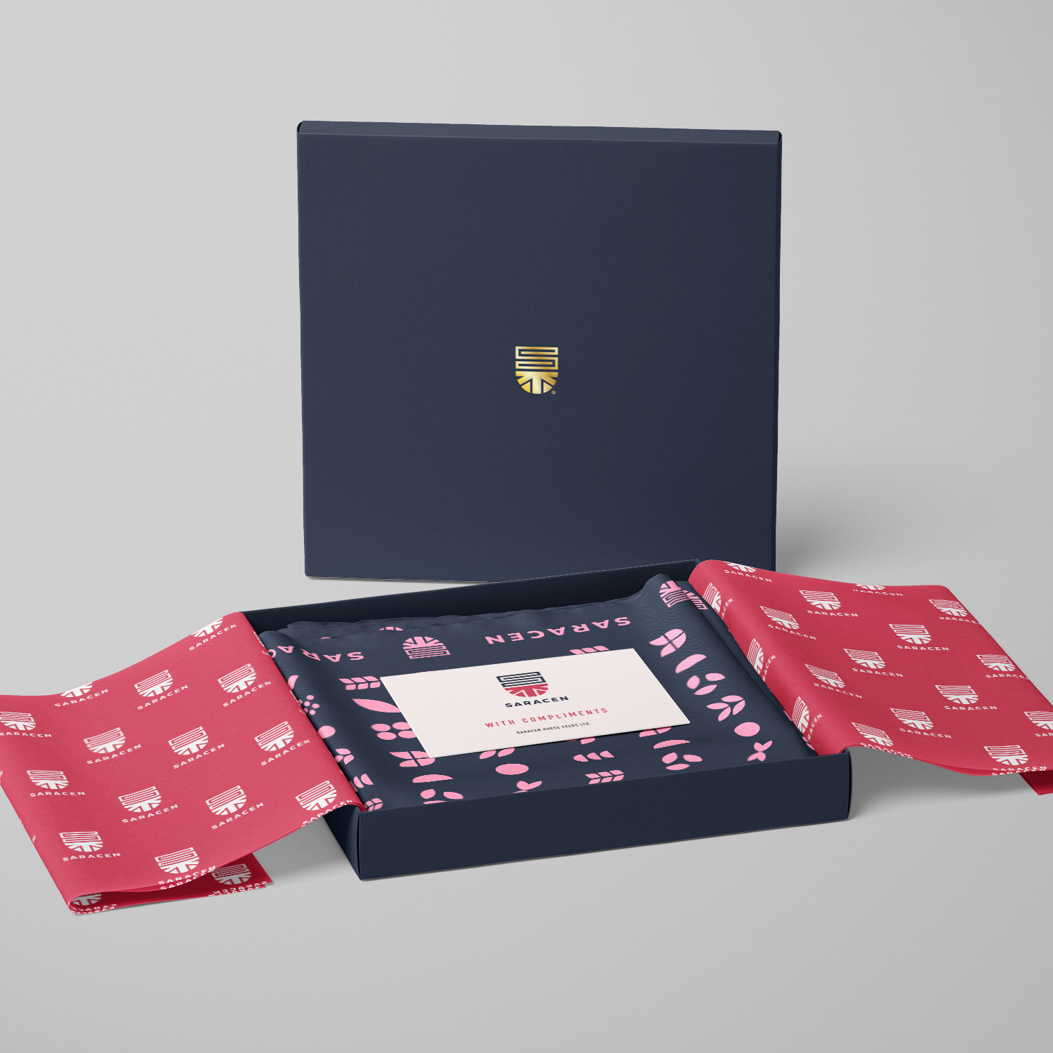
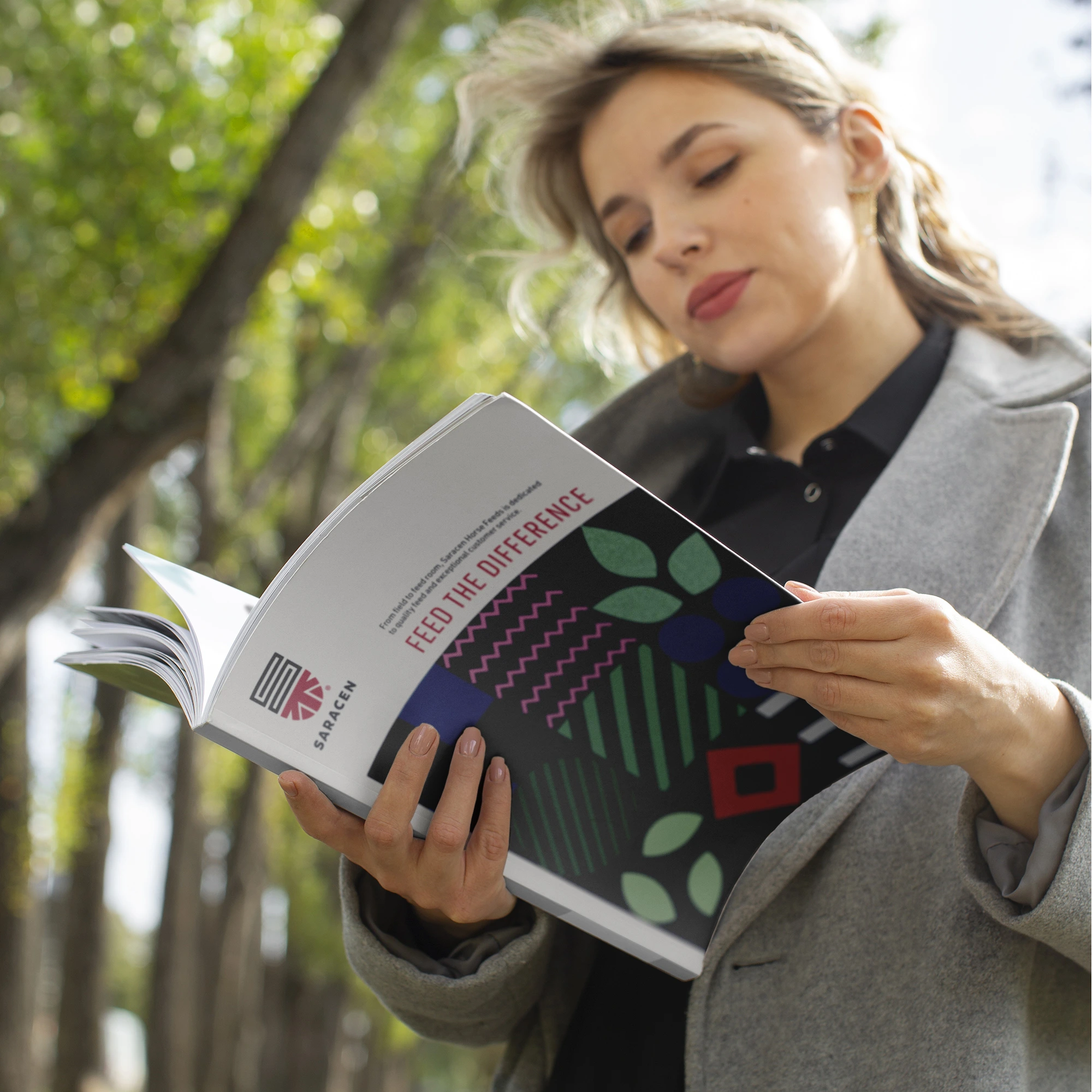
Saracen Packaging
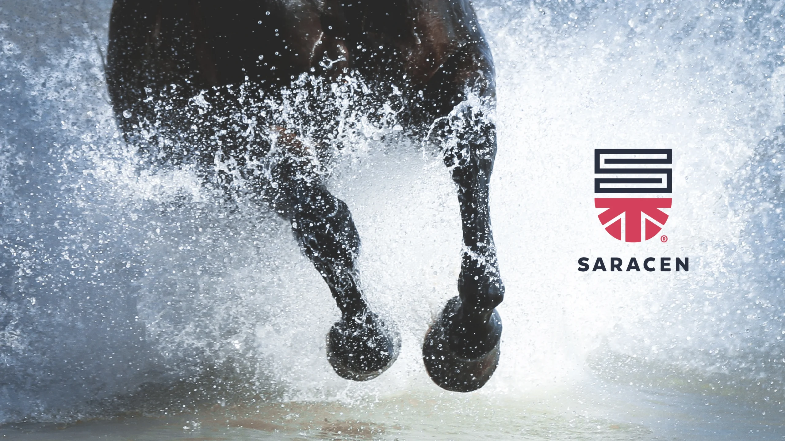
Repositioning a heritage British equestrian brand for a global, modern audience.
Background
Saracen is a family-owned British horse feed manufacturer with roots stretching back over 250 years. For the last 35, it has paired practical experience with leading scientific research to develop feed for horses at every level — from leisure riders to Thoroughbred racehorses and Olympic athletes. A recent succession created the moment to evolve the brand without losing the heritage at its core.
Brief
Transform a manufacturing-led business into a global, consumer-centric brand.
Insight
The equestrian feed market is saturated with generic health claims and look-alike messaging. Saracen’s real edge – partnerships with leading research labs worldwide, was real but not clearly communicated.
Solution
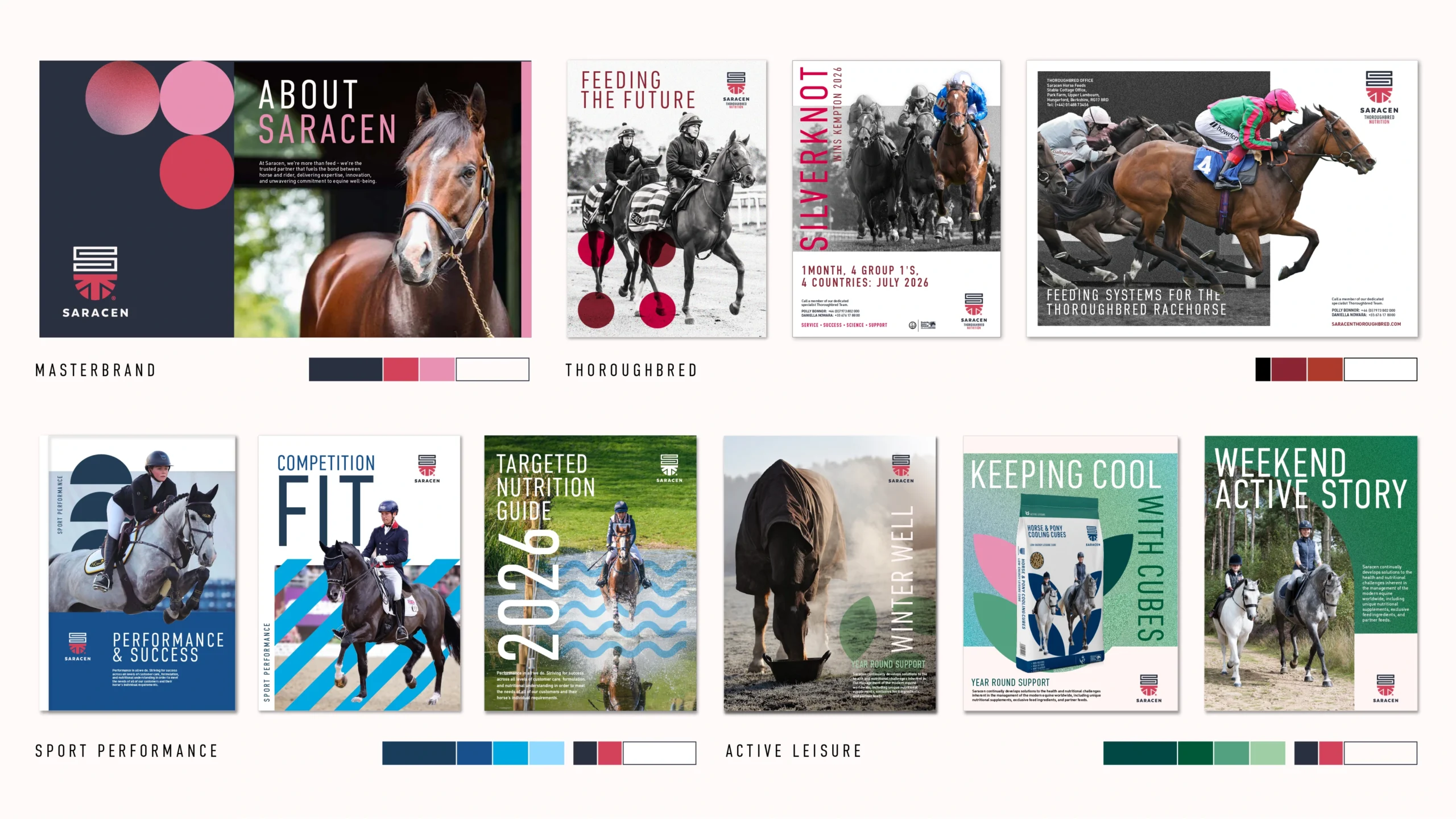
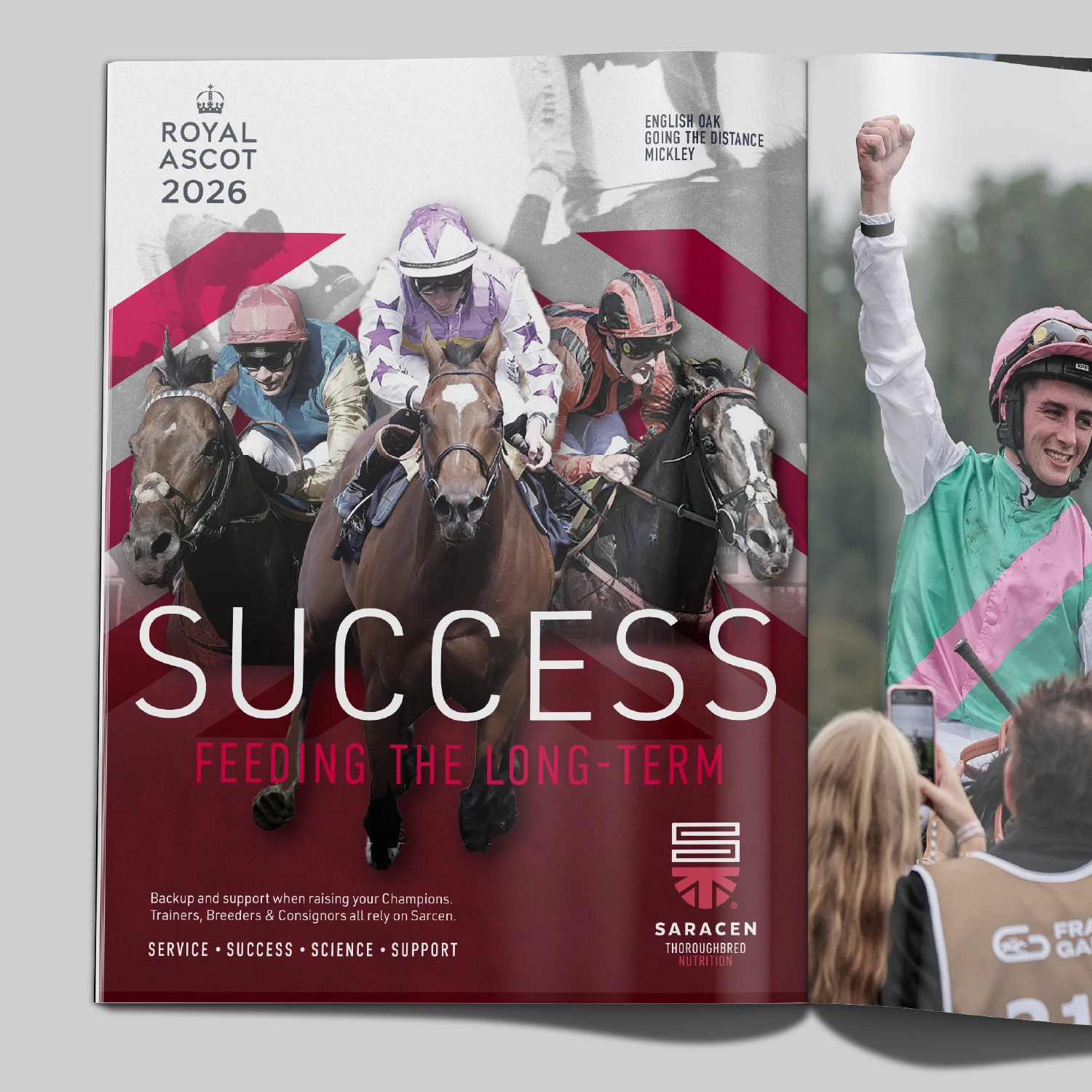
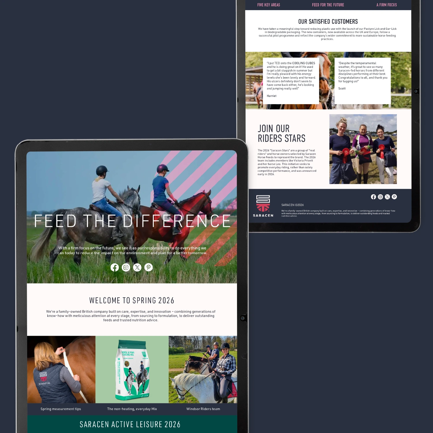
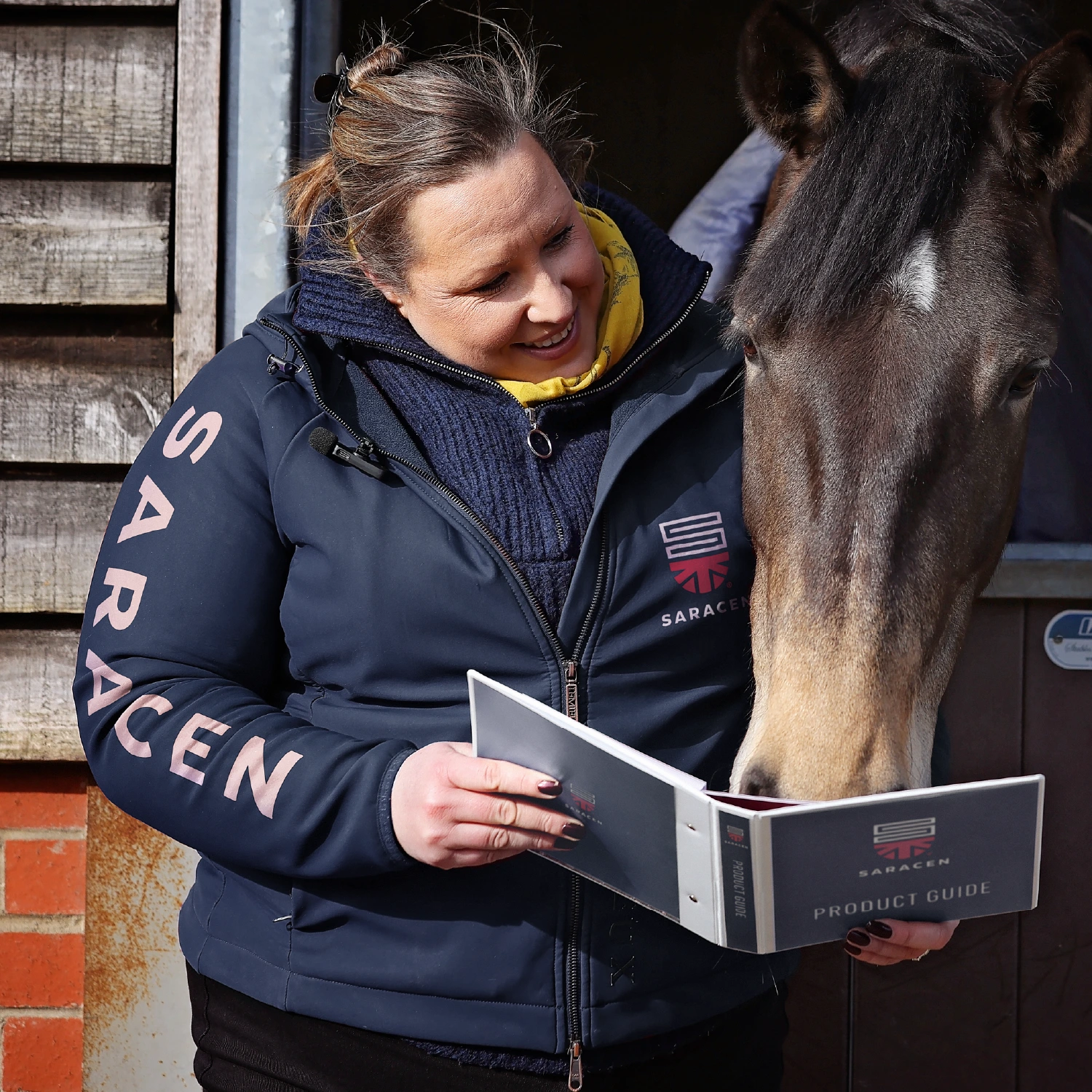
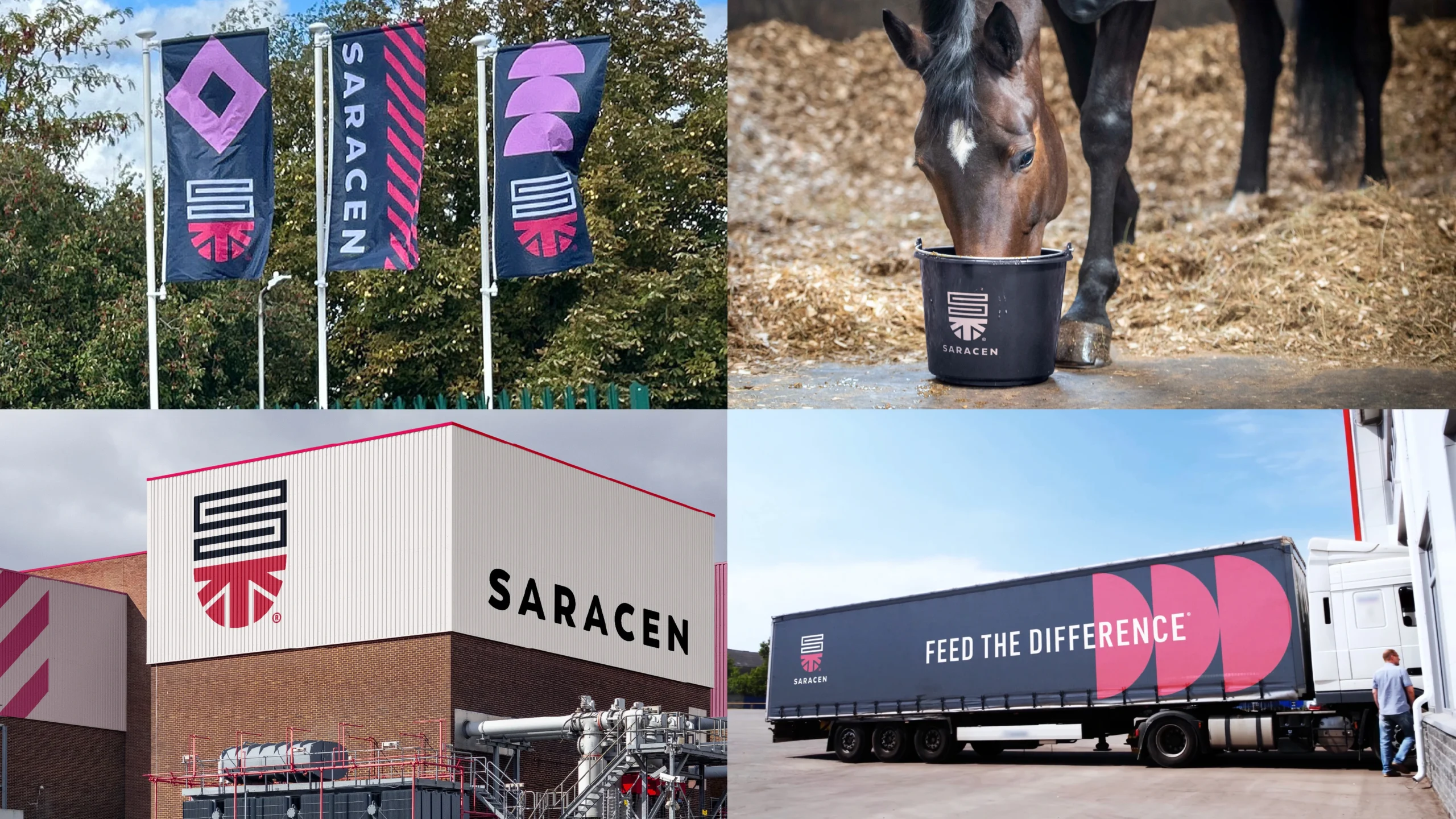
An identity system that breaks the category’s heritage clichés in favour of something more confident and science-led. The work centred on two principles: reduction and precision. A new shield brandmark and a stripped-back visual language carry the brand across packaging, apparel, sponsorship, retail, and elite competition – without losing authority or recognition.
Outcome
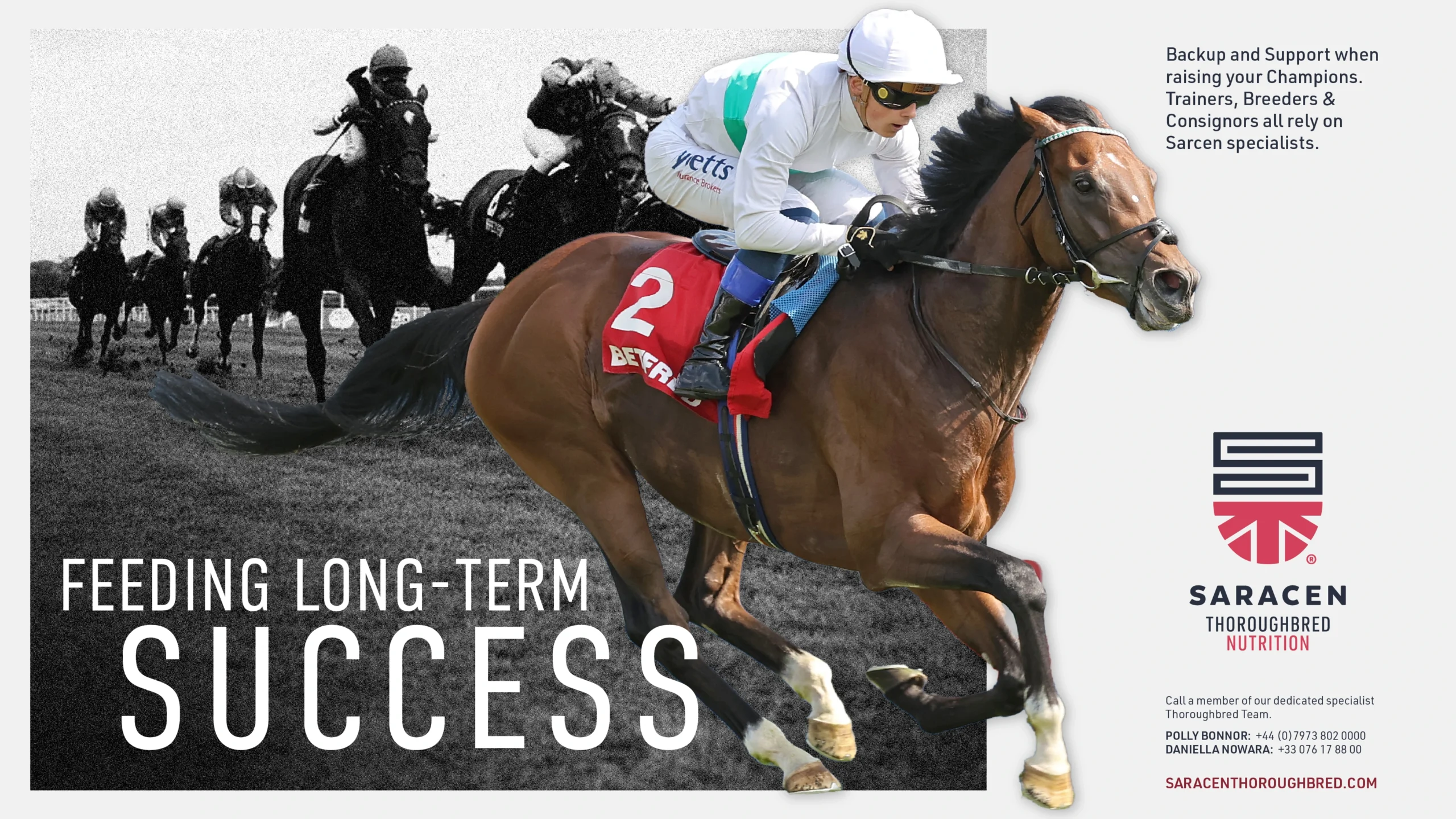
The new identity repositions Saracen as a brand that unites science, heritage, and performance. The shield now works as a badge of honour across the equestrian spectrum, from Olympians to weekend riders. Saracen is no longer just a feed manufacturer – it’s a performance partner. A brand built not on heritage alone, but on proven performance.
A brand built not just on heritage, but on proven performance.

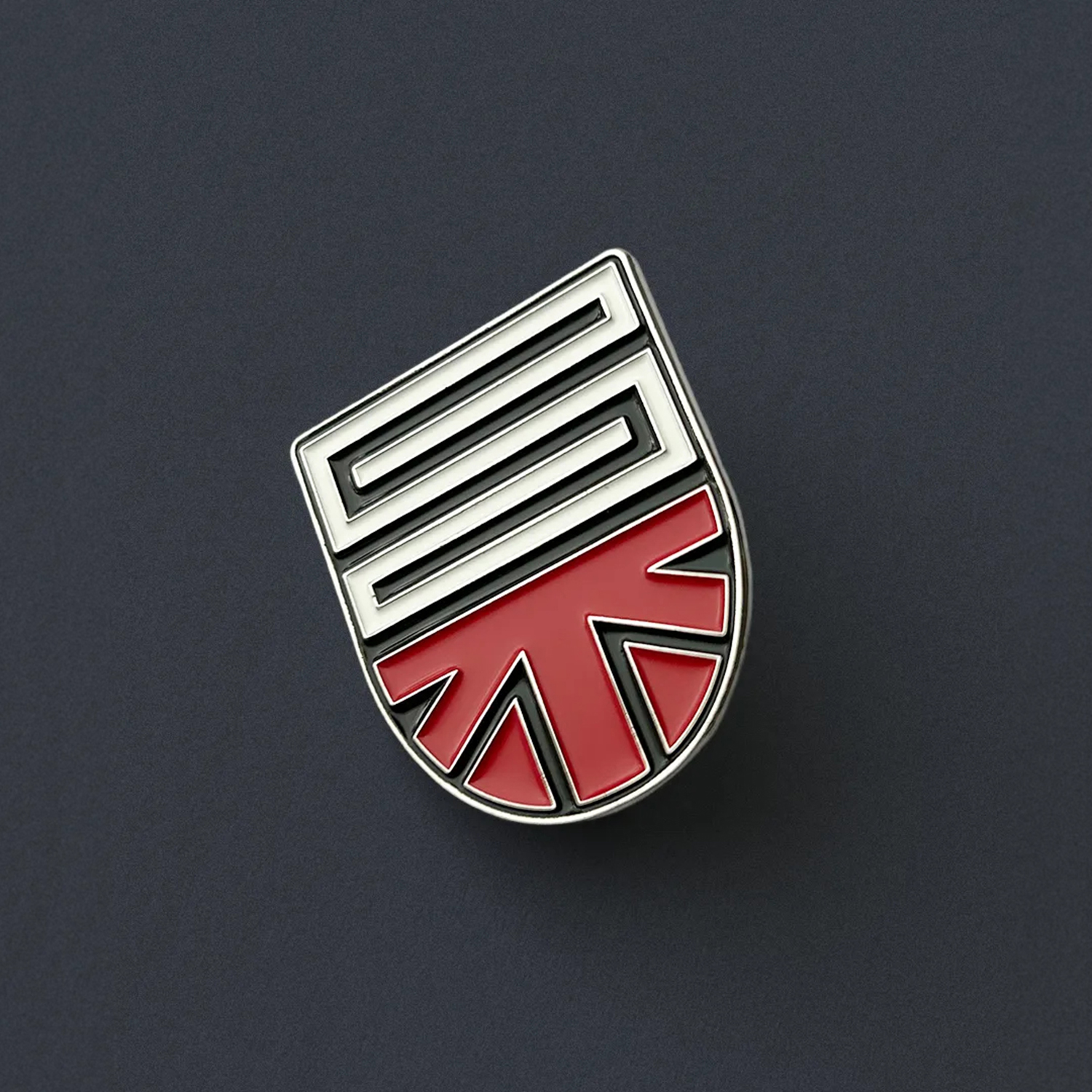
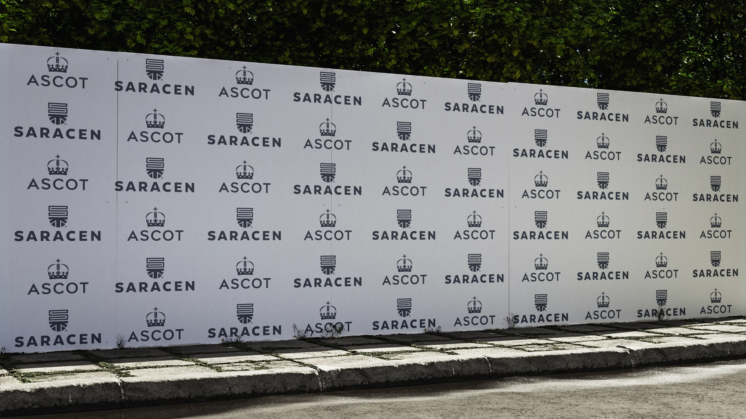
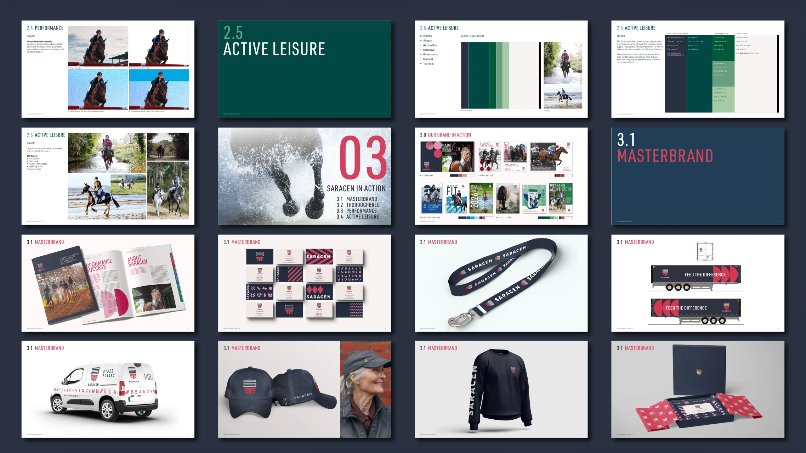
The shield brandmark
At the heart of the system is a distinctive shield brandmark – crafted as an ownable symbol of protection and performance. The mark combines an ‘S’ monogram with an abstract reference to the Union Jack, balancing British heritage with a contemporary, global outlook.
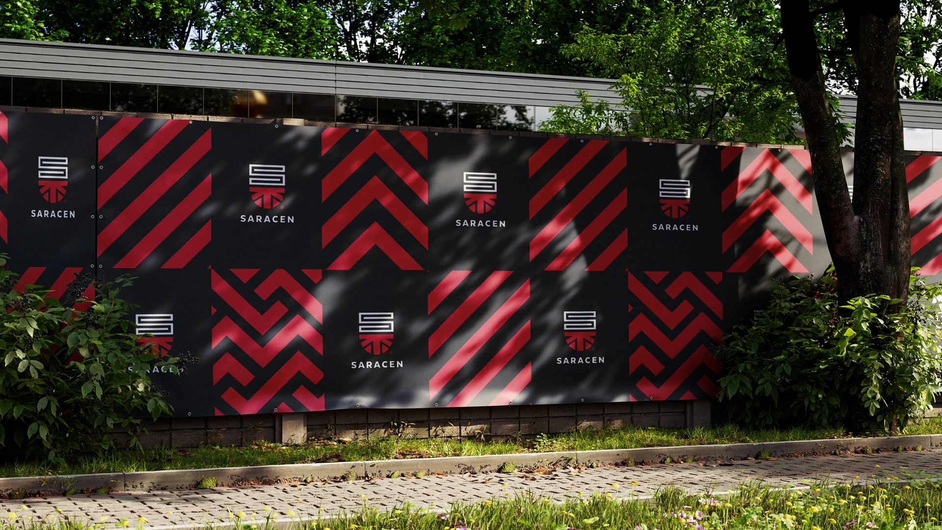
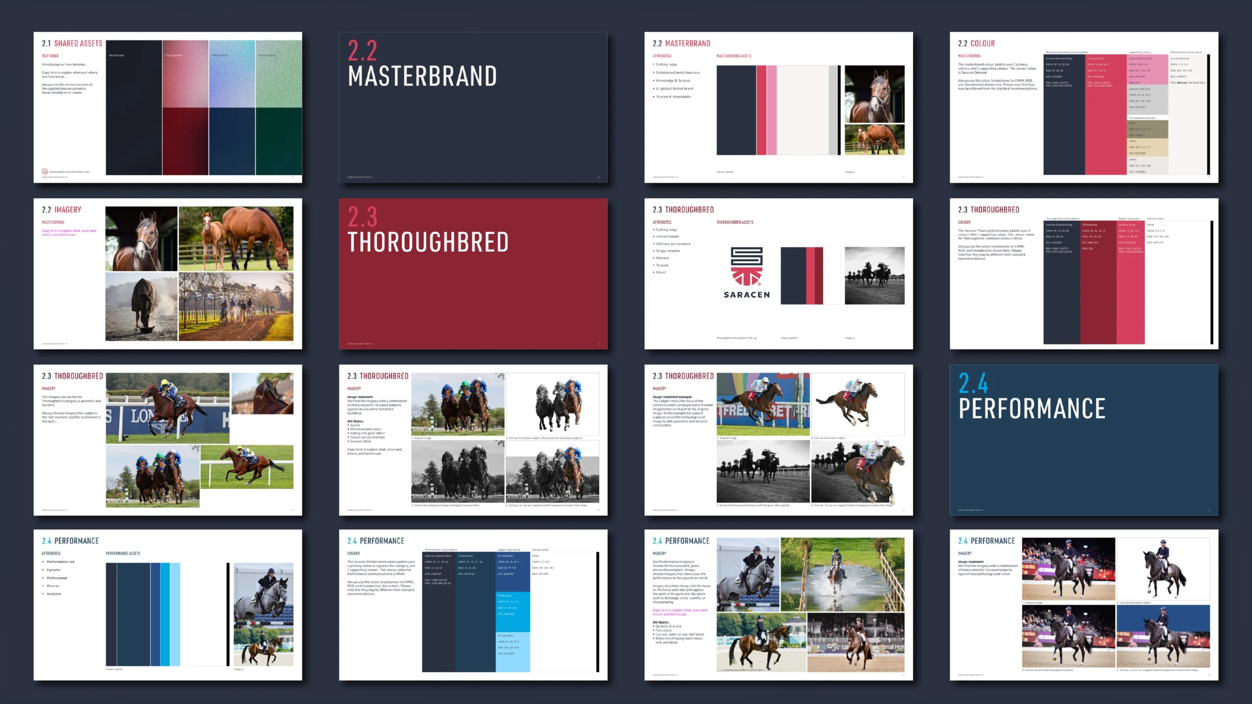
Colour palette
A refined colour palette of Diamond Blue and Coral reinforces associations with performance, prestige, and the upper tiers of equestrian sport. Each division of the Saracen business owns it’s own unique palette that helps customers navigate through each business sector.
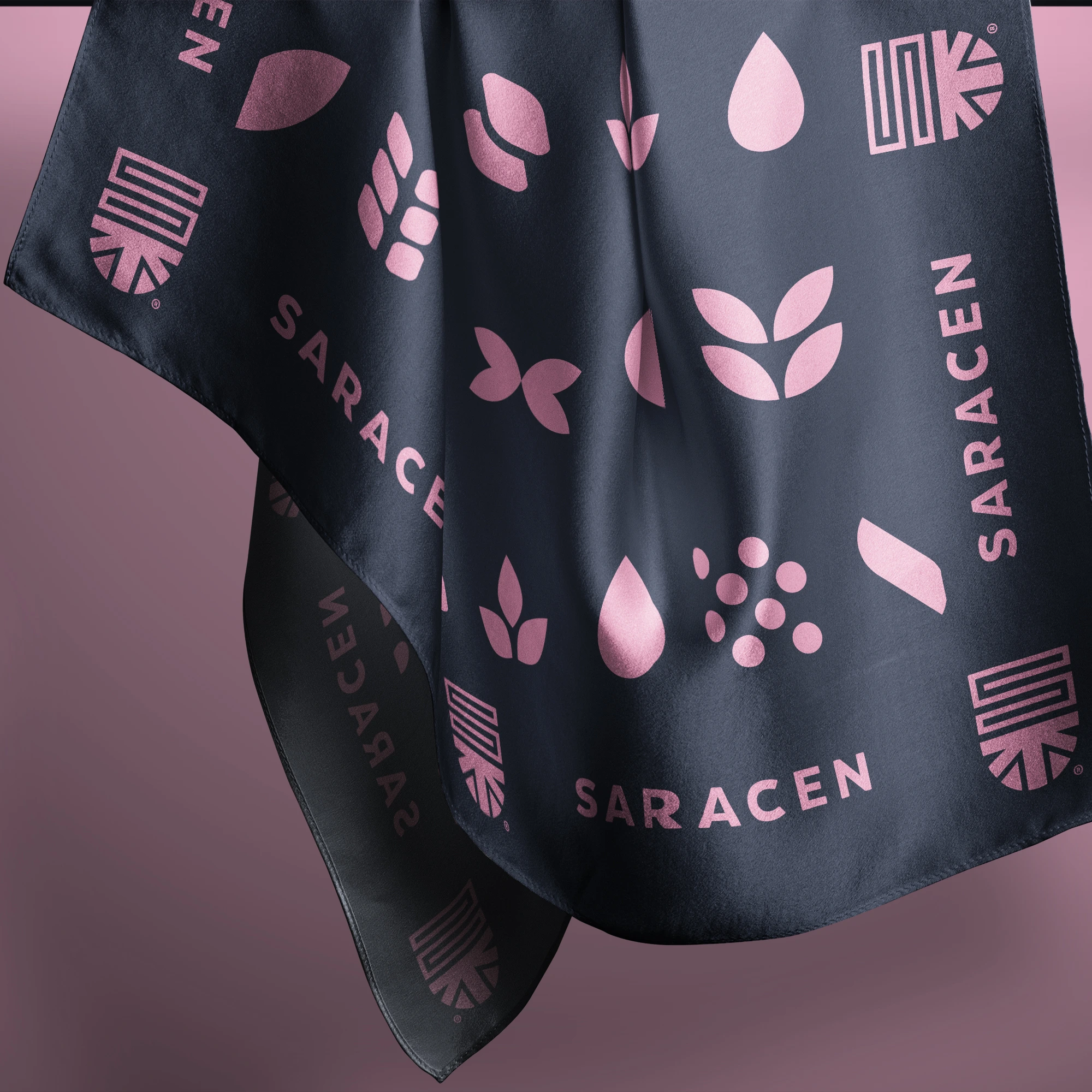
Iconography
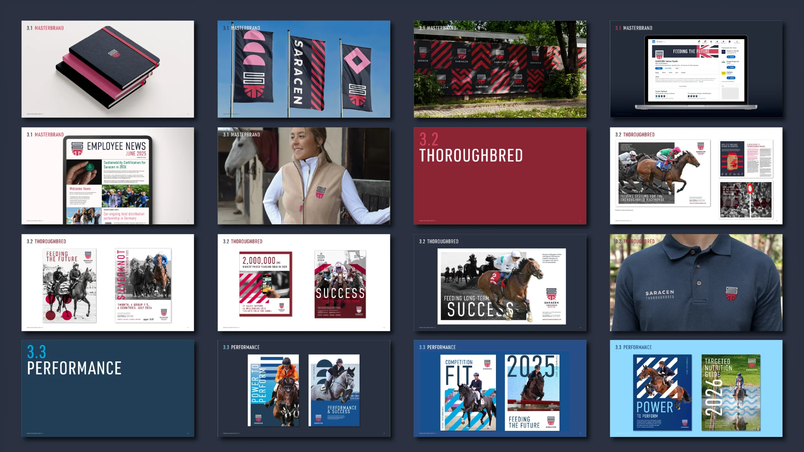
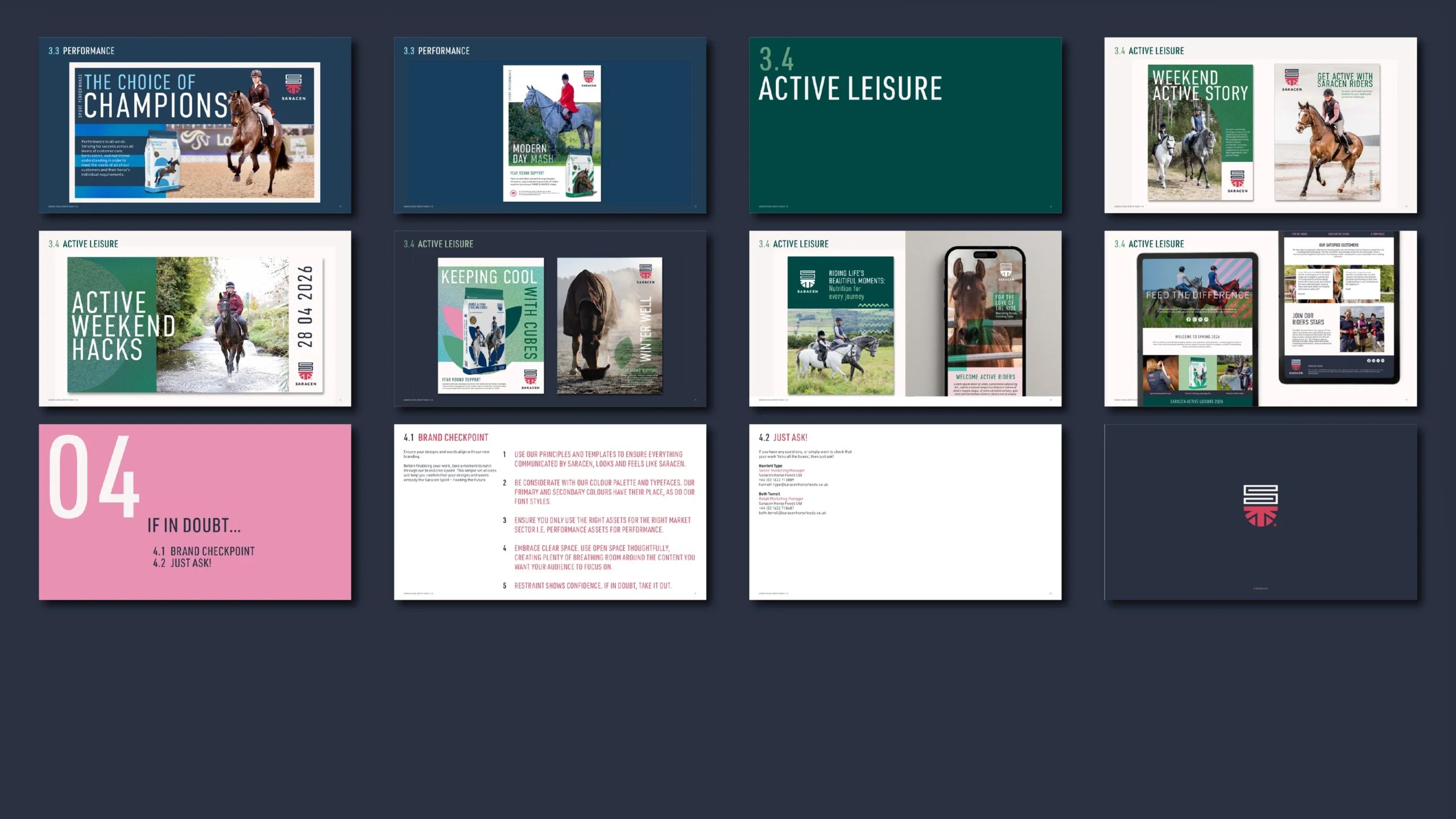
The supporting iconography reflects the breadth of the equestrian world, from elite racing to everyday horse ownership, creating a cohesive and flexible visual language.
Inspired by the racing team silks, the ingredients in the product, and the terrain commonly associated with the equine world.
The iconography system is applied across almost all Saracen branded touchpoints, adding recognition and distinctive ownability.
Credits
Brandmark craftwork
Stuart de Rozario @The Foundry Types
“Saracen has been part of my family for decades, so redefining who we are was never going to be a small undertaking. You understood that from day one – and took everything that makes us who we are and built something new that absolutely does it justice. The result is bold, considered, and built to last. I couldn’t be more proud of what we’ve created together.”
Fred Walker
Owner & CEO
Saracen Horse Feeds
“It was an absolute blast. Incredible work Dan. Thank you! We brought together a ton of experience and probably created one of the best rebrand pieces in our folios. So proud of this work.”
Gion-Men Krugel
SVP Marketing & Brand
Saracen