Vodafone
Making the most of now
Client
Vodafone
Services
Branding
Brand Guardianship
Art Direction
Global Guidelines
Studio
Brand Union
Vodafone was perceived as the most corporate out of all the mobile and data suppliers in the world.
Then they launched their new consumer positioning ‘Make the most of now’ as part of their new global advertising campaign. However, the look and feel and the brand’s tone of voice didn’t yet reflect this new brand idea.
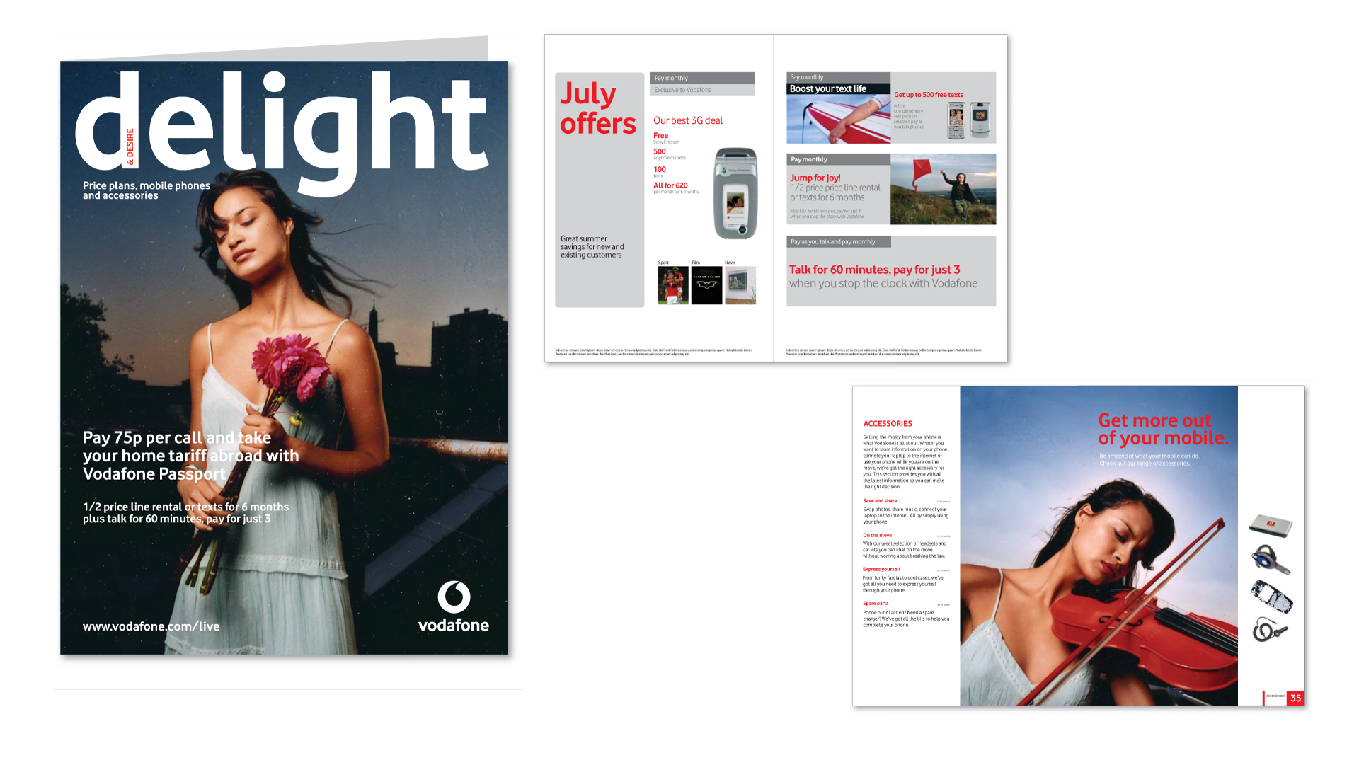
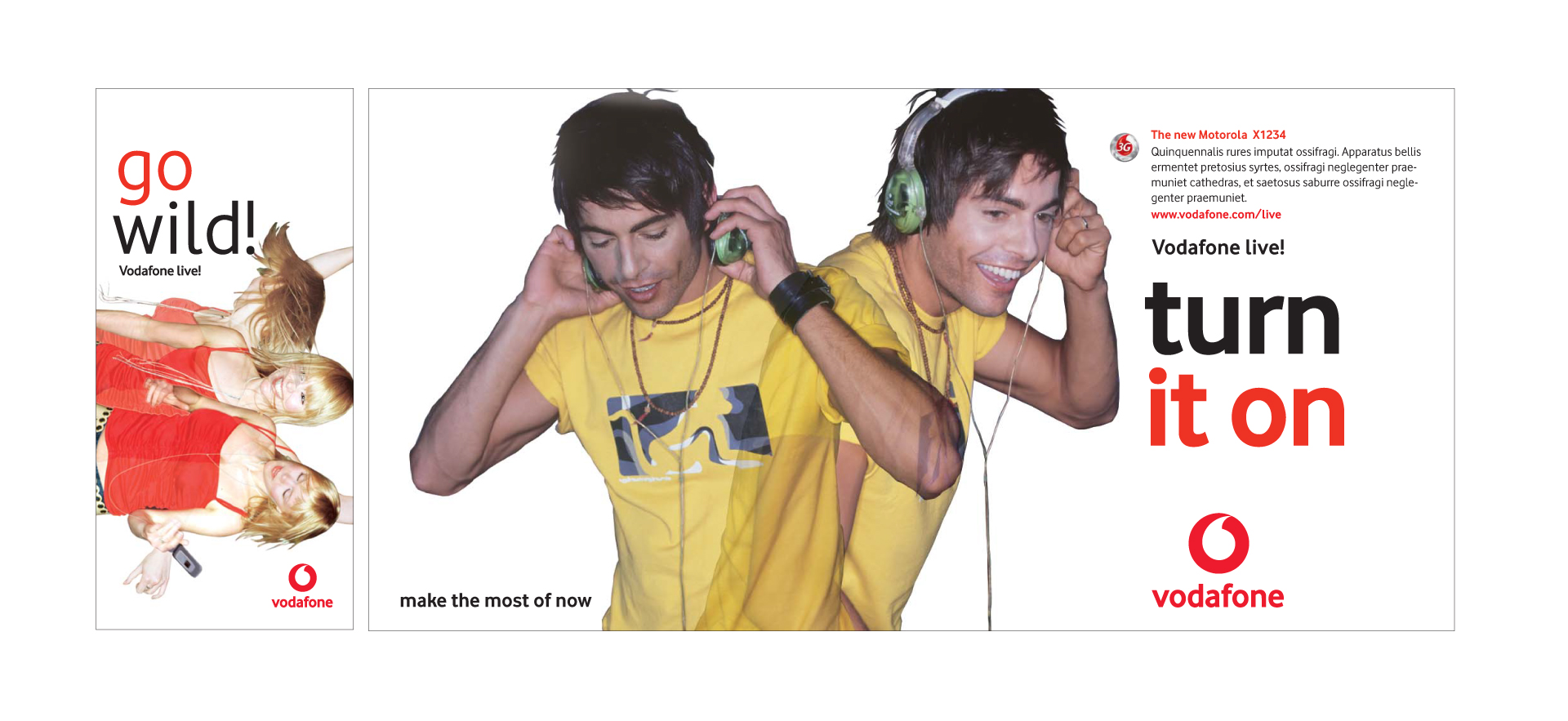
As the global brand guardians, we set out to re-define the visual style of the Vodafone brand. The result was direct, positive, and vibrant.
This direction took them way beyond the next level.
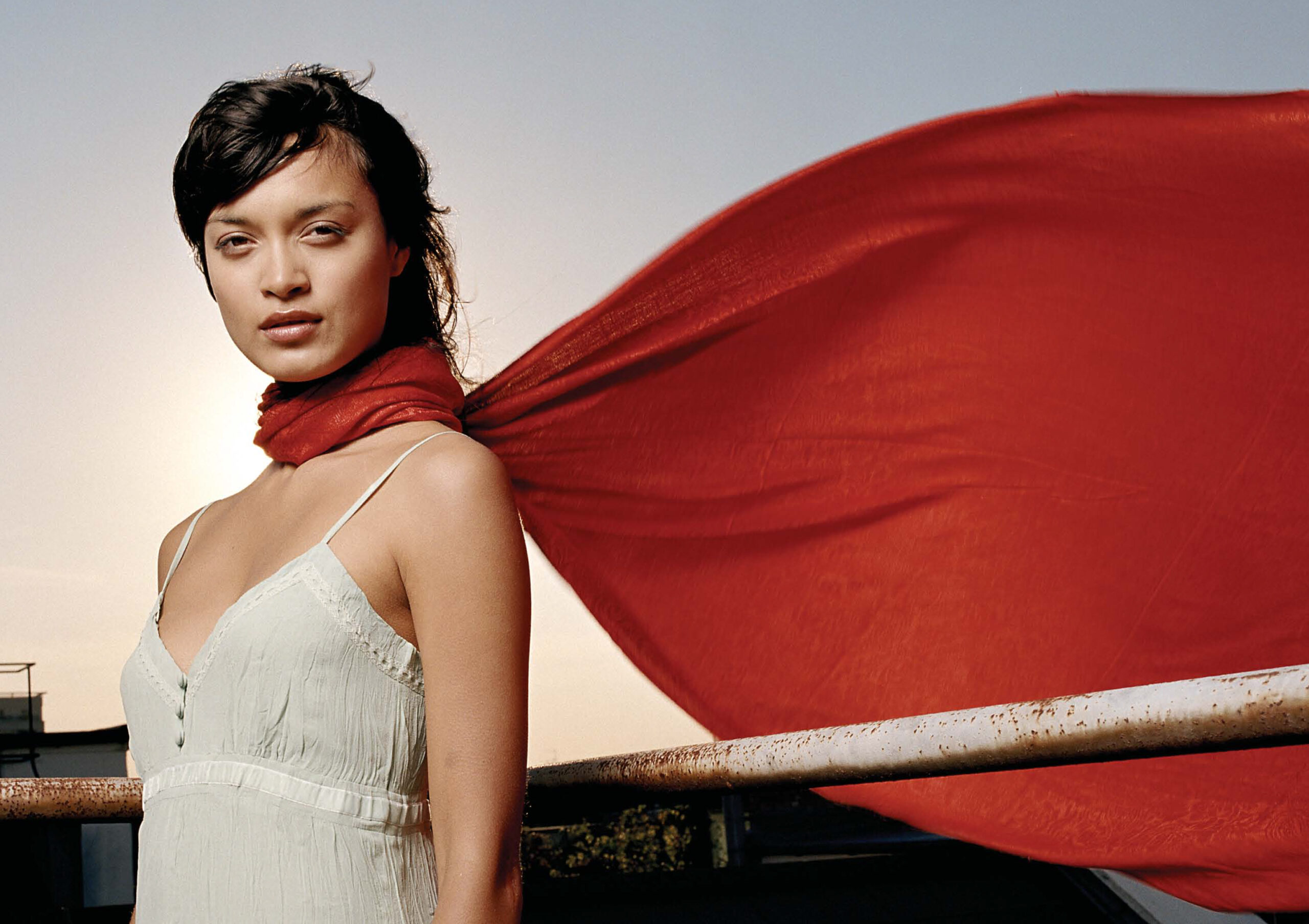
The brand essence is the single thought that captures the spirit of Vodafone. It was that unique DNA that drove our global direction through the tone of voice and visual identity.
Red – for the passion and spirit
Rock Solid – dependable and empathetic
Restless – always challenging the business to improve