Kandola+
Let's change the world for the better
Client
Kandola+
Services
Brand Identity
Digital Design
Art Direction
Role
Creative Director for Heavenly Group
A new brand identity for Kandola+
Background
Kandola+ is a global leader in Diversity & Inclusion (D&I) learning, helping businesses turn inclusion from a concept into meaningful action. Their platform empowers organisations to embed D&I in everyday practices, making real change possible.
Brief
With a major new online offer coming, Kandola wanted a way to frame their products and services and define the Kandola+ approach. They needed a clear brand that could show how they set priorities, innovate their offerings, and communicate the difference they aim to make, while inspiring engagement across their audience.
Insight
Kandola+ is more than a business proposition. Their approach to D&I is active, practical, people-centric, and transformative, helping organisations move beyond words to meaningful inclusion.
Solution
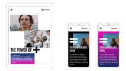
The Power of Diversity is the new brand strategy for Kandola+. It brings a fresh perspective to D&I and aims to create a movement that goes beyond corporate frameworks, turning inclusion into a culture and a lifestyle choice. Inclusivity is at the heart of the movement, inviting everyone to take part and celebrating the benefits of making D&I part of how we think and act.
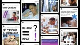
The visual identity reflects this philosophy. Inspired by the diversity of characters in language, it reinforces the idea that differences make us stronger. This identity forms the foundation for every touchpoint, bringing the Kandola+ story to life in a way that is both distinctive and inspiring.
The Power of Diversity
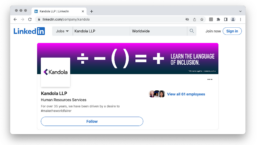
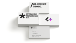
The concept for the new Brand Identity was inspired by characters found in language that is increasingly used as shorthand – the special characters we use to communicate. These special characters begin to communicate and support the Power of Diversity – everyone is different, and everybody communicates in slightly different ways. It’s these characters that became the building blocks for the new identity system.


